

Only a few years ago, you just built a website and that was it.
Now, the horses have been replaced by automobiles.
About a third of Americans surveyed recently said they use mobile as their primary way to access the web. And the number increases every month. That means that when they browse for a mechanic, accountant, or restaurant, they are walking down the street or sitting on the couch watching TV. They are on smartphones and tablets. Not the desktop.
Older websites just don’t look right on these devices.
Is your website a buggy whip?
Take a look at the images below.
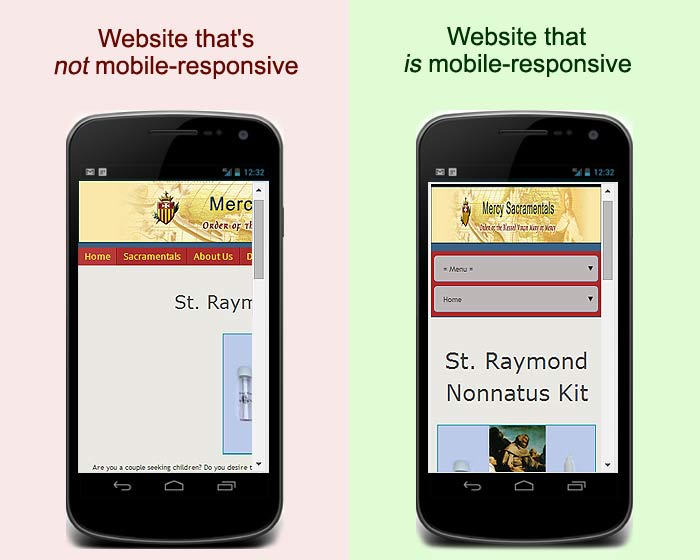
The website on the left must be scrolled around, left and right, to read the text and look at the images.
If your customers have to do that, they’ll simply go to your competition.
The image on the right is a whole new ball game. The page is sized so that it fits neatly in one column. And look at the page menus, in grey. You don’t have to scroll a mile to get to them. You touch them and they drop down.
When a website is mobile-responsive, the images, text and menus are resized so that you can easily read them.
Secondly, there is some sloppiness in the industry in using the terms “mobile friendly” and “mobile website.” Only a mobile responsive website resizes the page elements properly. Make sure you get one like this.
We can design a mobile-responsive website for you. It will be similar to this one. It will be built on the popular WordPress platform, which has thousands of plugins. That means lots of potential features. And we’ll make sure your site is easily visible on the most commonly-used devices.
When I build your project, I will coordinate it, and you can reach me easily by phone and email. I respond to my messages promptly.
Read more about it on our page, “Want to Crush Your Competition? Let Me Build Your Website.” Then call me at the above number, or go to my Contact page.
