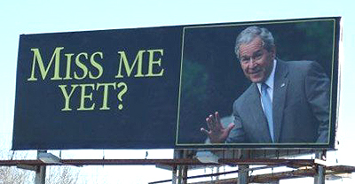
The student of advertising doesn’t have to sit in front of a digital screen to see pitiful examples of his craft being trashed.
Cruise down a highway in any major city, and you’ll see that the advertisers are batting only about 10%, maybe even less. Besides the cardinal sin of having too many words on billboards (drivers have about six seconds to read them, folks!), the missing link in 90% of ads is that they lack a memorable headline.

Here’s a good billboard that sticks in your mind. It’s simple and raises curiosity.
Billboard headlines should be limited to about six words. The ads should be simple. The headline should be catchy, but not too hard to figure out. I need to remember it long enough before I get to a mobile device or computer.
Thus, headlines as “Your Personal Injury Lawyer,” or “A Great Education” are going to slip out of my brain cells before my fingers can tap out a Google search.
In search of the “sticky” billboard ad
I recently drove for a good fifteen minutes, trying to find a billboard with a headline that would stick in my mind. I finally found one. It was “Help for Homeless Veterans.” The two “h’s” helped my memory. The next line was “Make the Call Now!” OK so far.
Next, they had a phone number that used a word. Sorry, but I didn’t remember this. I don’t know if there was a web address, but it was too late because I had passed the sign.
Now the real test. If I was a homeless vet, or was caring for one, I would remember this catchy but simple headline. So I searched for it online. No results with that name. Then I searched for “Help for Homeless Vets Chicago,” which is the city where I was when I saw it.
There were no listings with this phrase that led to the agency on the billboard.
That’s lost prospects.
Now, how difficult is it to run a Google ad having this exact headline, along with the subhead? How difficult is it to have a natural listing, with a page on a website with the same words as the headlines?
How difficult is it to design a landing page for an ad that has the same headlines, and the same picture of the elderly vet in the left-hand corner looking up expectantly? If that were done, the reader would say, “Aha – I’ve come to the right website!”
How many potential clients of this non-profit are lost with this poor follow-up every day? Fifty? One hundred? Five hundred?
Billboard advertising is more than just sticking your message in the sky. It’s following through on people’s behavior after those brief six seconds.


